Orbit Outdoor Toy Range
Branding, Packaging & Graphic Design Case Study (2.5-minute read)
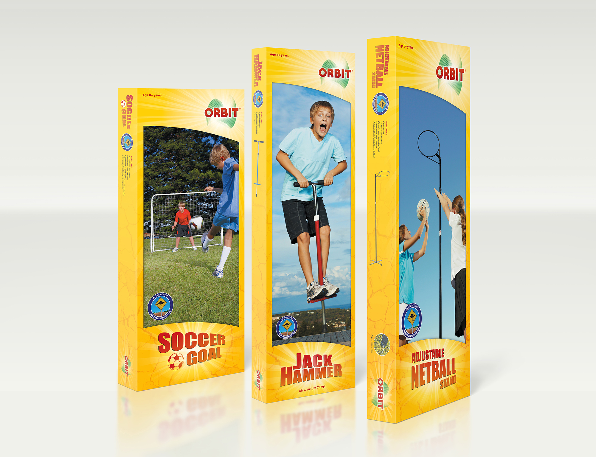
Task
To reinvigorate and modernise a once-iconic Australian outdoor activity brand, whilst staying true to it's origins. Orbit is familiarly known as the “big yellow box”, so it was necessary to keep that aspect.
Colour Palette
The orininal box's yellow was primary and garish. It caught attention, and differentiated the product from its competition, but suffered after that initial impression to either delight, inform or otherwise connect with the audience. The bright, unnuanced yellow also gave an impression of cheapness, in much the same way that bargain branding is often coloured in bright red and yellow. So the first thing I set to define was a consistent, pleasant and informative colour palette. In order to carry a prospecive audience from alert/alarm and possible alienation, I chose a warmer, more friendly yellow.
One of Orbit's greatest points of difference from it's competitors is that it's Australian, and it's products are Australian-designed. You can write “Australia” all over your packaging, but the important thing to realise about visual communication, is that you can send your message through every possible means - through wording, image choice, colours, patterns, shapes, texture, and feel. And when you do that, you send a message that is congruent, and therefor trusted on many levels of perception. Through my ideation phase I identified some uniquely Australian motifs for inspiration, in order to build a colour palette that instinctually communicates “Australian”: blazing sun, scorched earth and golden sands; olive green trees and scrub; and a wide blue gradiating vista from deep to sky blues. The bright sun and cracked earth motifs found their way into the necessary yellow box frame, and through my direction, the photography (shot on Sydney's Northern Beaches) prioritised the all-importantly balancing gradations of blue sky and green grass.
Logo
The Orbit logo needed not to deviate too far from what was already familiar to its existing customers. It was a bold, red wordmark, and this worked fairly well already as far as visual language went, but it definitely needed some tweeking. The letterforms were refined to create more friendliness, and also reflect the name “orbit”, by incorporating more dynamic sweeping arcs or curves in the “O”, “R” and “B”. Added behind the letters is an “orbital swoosh” device which is subtly suggestive of both orbital movement, and of the shape of the outline of Australia.
The Boxes
The original yellow rectangular frame was adapted to include arcs at the top and bottom, to add interest and also reference the dynamic and curvy visual language already used in the logo. Curved, bold, red-earth coloured product names project a feel of grand adventure, in much the same way as the titles of a western film or Crocodile Dundee might. The hot sun bursts through from behind the logo and product names, spreading crepuscular rays, and cracked earth patterns adorn the rest of the yellow-coloured realestate to varying degrees.
Aussie Active
Sensitive to the fact that it was no longer viable to have the Orbit® products made in Australia, the marketing team created Aussie Active™ to emphasise that the brand is still Australian-owned and the products are still designed in Australia, with a long history in the country, and a recognition of what's unique to Australians. I illustrated the uniquely Australian emblem adorning the boxes, to sell that point.
My Roles/services
Branding & identity
Illustration
Package design
Art direction of lifestyle photography
Supplementary cross-sell brochures and other material
