Pictogram.com.au
Branding & Web Design Case Study (4-minute read)

Overview
Pictogram is a small Sydney branding & design agency that was in need of an updated website. Pictogram has a long (30+ year) history, and the client needed the site to balance the importance of history and expertise with trustworthiness, and playfulness and creativity. As well as offering a visual refresh, the new site was an opportunity to include wider service offerings and news stories, and encourage more interaction.
Colour Palette & Icon Patterns
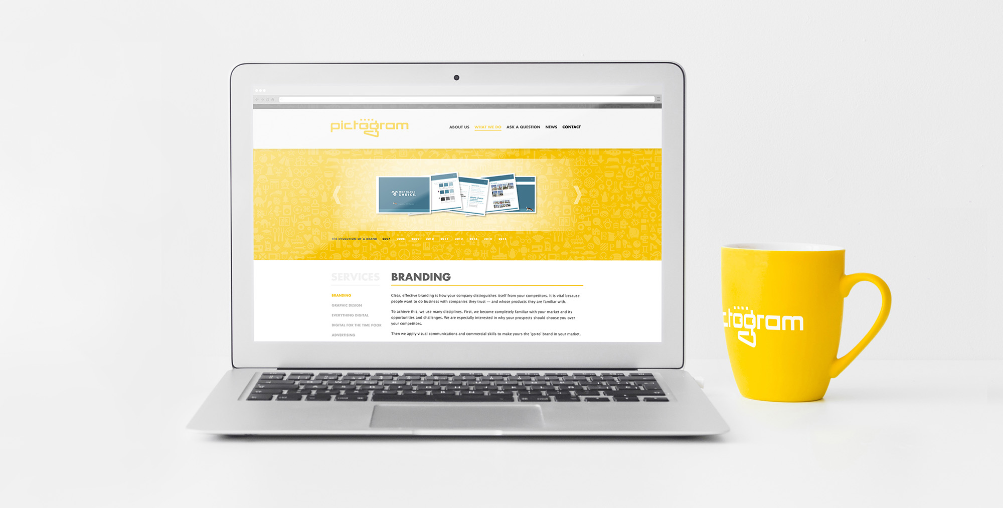
Yellow, for Pictogram, has been an important differentiator in their particular market, and has been used to great effect throughout their print material. For Pictogram's web presence, after tweaking the yellow for better on-screen legibility, I introduced a much-needed secondary colour palette – crisp greys to complement the now sunnier yellow.
Through a process of consultative design research with the client, we arrived at an idea that was worth some experimentation: it might be a shame not to emphasise the meaning of Pictogram's actual name. After a few iterations, below is one of the final patterned background images that uses pictograms in it.

Timeline
As one creative solution for providing some historical perspective and playful interactivity, we came up with the idea of a panning timeline. It integrates important moments in time for technology across the world with Pictogram's history – the ups and downs of both are combined in a cohesive upward-trending line graph. And for each year, when the user hovers, they get a glimps of a favourite Pictogram project completed in that year.
It took a bit of development, but I managed to structure the timeline with a very low resource load (so it appears straight away when you go to the page), and arrange it in such a way that the user's experience is delightful on either desktop or mobile.

Design Opportunities
To improve consumer trust, and encourage engagement with the site, I included two notable features into the design for most pages. The "quick contact" forms at the base of each of the service pages allow a low commitment and time investment of the user, and offer a customised experience for each particular service. And one of the items, integrated within the design, that helped to provide increased trust among users was the inclusion of randomised testimonial quotes.
Mobile Responsiveness
When it comes to mobile responsiveness, I coded the site to respond to natural break points. In case you're not familiar with those terms, this means that instead of creating different representations of the site for a limited number of devices (like mobile, iPad, and desktop computer), I instead designed by scaling the view, and programming design changes for individual sections at the point just before they look less than ideal for that size. This approach future-proofed the site by making it appropriately designed for any conceivable device.
Many mobile sites follow a popular trend by using a "hamburger menu". That's just a silly name for the symbol that consists of three horizontal lines. It means that more items can be found by clicking on it. Usually links. But its use offers no context via symbol or text of the kind of information that might be found. There are some designers who argue that it's a bad idea, and there's also some research to suggest that many (particularly older) users don't even know what it means. I'm not entirely convinced either way, but personally I think it's lazy design – if it can be avoided, it should!
For an example of navigation options that can't otherwise be refined or eliminated for a mobile experience, I suggest you visit pictogram.com.au on a mobile to see my preferred solution. As you can see in the mobile image below, instead of using a potentially misunderstood "hamburger menu" to hide navigation options, this solution uses two elements in design that provide clear meaning. The fade suggests something is hidden, and potentially scrollable. The arrow suggests more can be seen in that direction, and also brings with it associations of scroll bars and drop-down menus. A more discoverable solution that a user can both scroll, and expand to a fully-visible drop down menu.

My Roles/services
Branding & identity
Sketching, wireframing & initial design, through to completed project
Icon illustration
HTML, CSS, and integration with Adobe Business Catalyst
Javascript & CSS animation
Image optimisation
Search engine optimisation (SEO)
Things I didn't do: logo design, content writing, search engine marketing (SEM) strategy