Tempo Holidays
Branding & Design System Case Study (7-minute read)
Overview: A Brand Audit
As the most senior designer at Cox & Kings Australia, Tempo Holidays is one of two travel brands I had the responsibility of overseeing (the other being Bentours - Scandinavian Specialists). When I was brought on, it became obvious that the two brands, but especially Tempo Holidays, were suffering from a lack of leadership, direction, and a continuous brand stewardship. As a result of a previous lack of resources, records, documentation or even handover for staff, the brand's visual identity had suffered.
Competitor Research
When tracing the history of design assets/publications, the first observation that struck me was that Tempo Holidays and Bentours had begun to merge. They had lost a lot of their original discerning visual differentiation. I examined each of the visual motifs and what they said about each of the brands. Bentours' documentation made it much easier to rein back into a cohesive visual idenity, which is why the focus of this case study is Tempo Holidays. While Bentours' visual idenity gave an impression of clean, crisp and reputable, with a subtle hints of the Northern Lights and a Scandinavian design aesthetic, Tempo's visual identity, through its choice of colours and motifs suggested cheapness and and a confused identity. It reflected the reality – Tempo had grown from a predominantly Mediterranean holidays-based offering to serve holiday experiences in almost every continent. In its growth, its design sensibility said goodbye to its roots and tried to be everything to everyone. Without obvious history and integrity many brands will flounder. Luckily history and integrity are what Tempo Holidays had – the branding just needed to reflect that!
Through analysis of Tempo Holidays' competitors' collateral, I noticed not only was it visually indestinct from the company's other brands, but it was also indistinct from a few of its competitors. Tempo shared quite a few similarities with Flight Centre – in particular, it shared a very similar red, which is one of their most noticable features. In a saturated market, a brand like Tempo Holidays can't afford to be confused with others.
As a guiding principle, the goal I created for Tempo's visual identity, was to meet the challenge of being so visually discernable that travel agents (and eventually more and more travellers) would be able to identify Tempo from any part of its collateral – even if the logo and contact details were covered, you'd be able to pick it.
Previous Designs

Colour Palette
The first order of business was to ditch the "violators" (bright red and bright yellow). They are the colours that attract and immediately revolt. They say "cheap", and get you in and send you out. Just like McDonalds.
McDonalds has learned over the years, for the interiors of their restaurants, natural wood and earth tones are more comfortable to be among, and are less stimulating for the eyes. In a similar way, my aim for the Tempo colour palette was to attract attention and then keep it.
The sepia and cream were inspired by faded inks and tarnished paper of old-world travel maps. The earthy tones complement the blue (from the logo and original colour palette), and offer a mature warmth and approachability. The vibrant blue is used sparingly as an accented neutral to attract, while all of the other colours, used in abundance, help to keep an audience comfortably engaged.
Visual Motifs
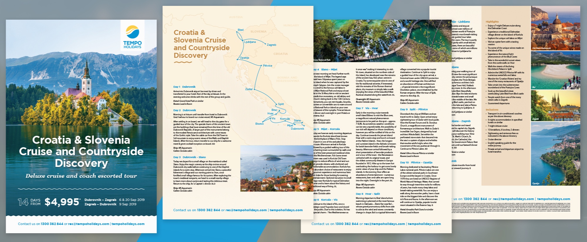
Also inspired by the old-world maps is the "sine wave motif". More than just signifying water, by being constant its visual language represents calmness, progress, ease and predictability. The element is used throughout, as a separator, header underline, as water in maps, and as a background pattern to help distinguish text from busy imagery below. Old-world inspired wax stamp illustrations as callouts also use the sine wave. By crowding in so many beautiful images, Tempo's old designs didn't do themselves any favours, so the new focus of Tempo's collateral is on specifically-chosen, impactful, confident offerings and beautiful imagery. The illustrations are all muted or subtle in order to serve this ideal.

Design Systems
Once the design templates were final, I moved on to updating the typical visual style guide documentation (logo usage, colour, fonts, images, patterns) for greater clarity. I found tables to be the best way, in most cases, to effectively communicate tricky, logic-based use cases.
Below are some examples of fairly straightforward branding choices – to find out how I expanded the specifications when it comes to equiping design teams, and creating design systems, read on in the next section...

Design Tool Development
By identifying both pain points within the design team, and the monotonous repetitive tasks involved with each of these flyer jobs, and then teasing out the logic behind them, I developed a few productivity tools with the goal of freeing up my team's time to dedicate more attention to creativity and strategic thinking.
Along with a few approaches including job logging and scheduling, better documentation, "productising" design services, reoganisation of file systems, and reviewing processes, I also created the following tool for my team – the solution of which I'm most proud.
First off, the Batch Export tool checks if the design file's naming convention has been properly met, and responds with instructions if not. When you continue, the tool gives tick-box options to export PDFs for high resolution, low resolution, and one with specific settings to address the needs of external printers. Based on the filename, the tool also guesses the folder structure for where to store the PDFs when done. When done, all of the PDFs are exported in the background, stored in the design folders, and also replicated across folders in other servers specifically for use of the sales and marketing teams.
As a hidden benefit, the tool also includes a metadata script I created a while back. It takes a while to generate on large files, but you only need to do it once. When ticked, the script goes through the elements on all the pages and lists the file location, images used, number of pages, page dimensions, page size ratios, swatches, and a more tricky-to-make feature: named colours (based on a precise setup of if/else statements regarding hue, saturation and brightness, the script will list up to 38 different named colours). All of this data is incredibly useful for an overworked design team – it means you can search for files based on what colours it used, or which files used which images. For an example, when you can't remember what it was called, you can do an easy search for that A1 poster design that had "teal" in it.
For each category of design document, I created a template. Each of the templates includes widest case scenarios, annotations for use, and pre-programmed "Conditional Text" for Australia and New Zealand. We found that changes were often requested after we saved different versions for both countries' prices, terms, and contact details. Using the feature of conditional text allowed us to keep both options in the one document (kind of like switching on or off different layers – but for lines of text) to save version control issues and extra labour. And when the Batch Export tool detects those conditions, it gives the designer an additional choice of which ones to export.

The Result
As well as an increase in brand recognition, engagement, and consumer trust, the brand refresh and associated templates and design tools brought an average 64% increase in project turnaround speed for the design team – which I'm pretty happy about.
As well as that benefit, the limited brand refresh meant that all previous branded signage, lightboxes and expo equipment were all still in style (no change to logos, primary palette colours or font selection), so the money that might've needed to be spent updating those was saved.

My Roles/services
Branding & identity
Sketching & initial design, through to completed project
Vector illustration
Design templates
Design system / style guides
Design Ops / design tool development (ExtendScript for InDesign)
Things that were a collaboration: Branding vision and voice (marketing team), and final flyer examples (design team).
Things I didn't do: Logo design, and content writing